Item added to cart Check Out

Item added to cart!
Keep shopping or check
out now.
FALL 2022 QUARTERLY EDITION Hatch Direct from Nashville
Never Miss an Edition
Our Year-Long Subscription delivers every limited edition to your door the day it launches.
Start a SubscriptionThese Pair Nicely

Bumping Elbows with Ghosts
Nashville’s legendary letterpress print shop was founded by the brothers Hatch in 1879 and remains the living heartbeat of classic American poster design. Since the early days of our Quarterly Editions, we knew that to explore the history of American printing, publishing and design, we were going to have to collaborate with Hatch Show Print.
“Bumping Elbows with Ghosts” is a short film we shot at Hatch Show Print while this collaboration was on press. We explored their amazing archives, learned a ton, and for the most part, managed to stay out the way.
Pressing Issues
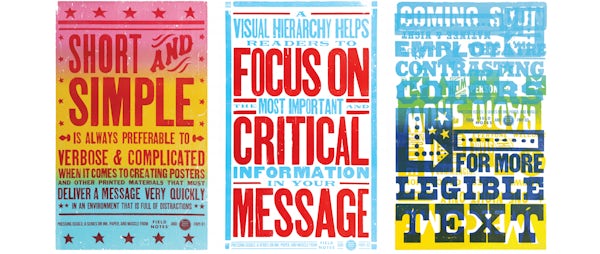
Hatch is known for letterpress-printed posters. For many years, they’ve found ways to recombine their enormous archive of historic images and type in ways that always seem fresh and vibrant, but also timeless. Hatch makes large posters. We make small notebooks. Here’s how we worked together:

We imagined a three-poster public service campaign about effective poster design, which we named Pressing Issues: A Series on Ink, Paper, and Muscle. We wrote some copy and made a couple of really rough sketches and the left it to the crew at Hatch to design and print.
And. They. Killed. It.


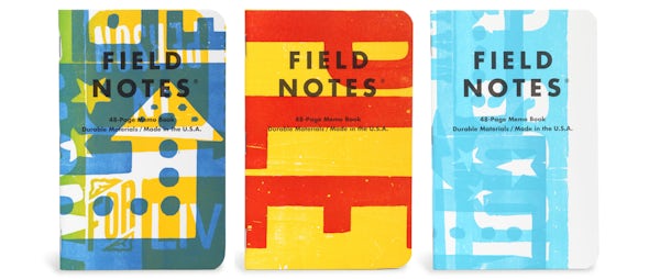
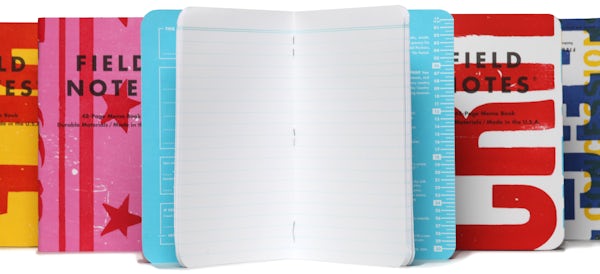
Next, we cut up the three finished posters into covers for our Fall Memo Books. Each poster yielded six covers, and we included one book from each poster in the 3-Packs. As a result of that, and the natural variations in letterpress printing, there’s a ton of variety in the run.
The covers are on Domtar Cougar 100-lb white cover stock with a brute-force application of a variety of hand-mixed Kennedy oil-based inks, including “Just About Pantone 637.” The body pages are ruled in light blue on a smooth 60-lb text stock from Finch.

SPECIFICATIONS:
- 01.
Proudly printed by the good people of Hatch Show Print, Nashville, Tenn., and Team Concept Printing, Carol Stream, Ill.
- 02.
Cover: Domtar Cougar 100#C “White” with a brute-force application of a variety of hand-mixed Kennedy oil-based inks, including “Just About Pantone 637.”
- 03.
Innards: Finch Opaque Smooth 60#T “Bright White,” with a fine, 1-color application of “Actual Pantone 635” soy-based Toyo ink.
- 04.
Outer cover printed over 32 hours at Hatch Show Print by Cory Wasnewsky with support from Nick Larson, in two passes on a 1942 Miehle 29 sheetfed press.
- 05.
Inner cover/innards printed on a Komori GL 640L 40" 6-color UV offset press.
- 06.
Bound with a Horizon SPF-200L “Bookletmaker” stitcher with dual feeder towers.
- 07.
Corners precisely rounded to a 3/8" (9.5mm) radius with a Challenge DCM double round-corner machine.
- 08.
Ruled lines: 1/4" (6.4mm).
- 09.
Memo book dimensions are 3-1/2" × 5-1/2" (89mm × 140mm).
- 10.
FIELD NOTES uses only the Futura typeface family (Paul Renner, 1927), in collaboration with Monotype.
- 11.
All FIELD NOTES memo books are printed and manufactured in the U.S.A.
- 12.
UPC: 850032279147


