Item added to cart Check Out
Get New Products and Deals First: The List

Item added to cart!
Keep shopping or check
out now.
These Pair Nicely

Brushes With History
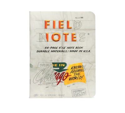
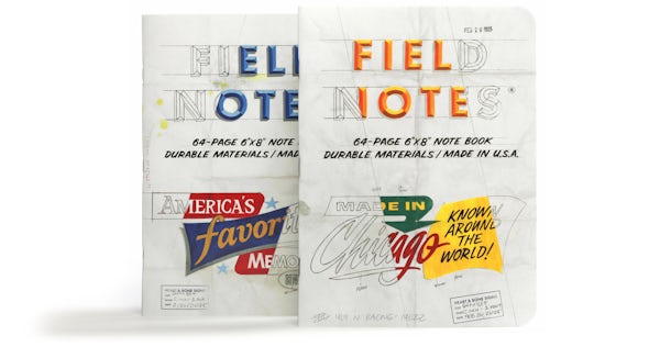
Our 66th Quarterly Limited Edition for the Spring of 2025 is “The Chicago Look,” Edition which explores a chapter of American design and typographic history through the lens of a single, highly influential — and sadly now-defunct — enterprise.
The Beverly Sign Co. put Chicago at the center of the mid-century sign-painting map with its “panelized” compositions, novel typographic treatments, and bold colors. This style came to be known as “The Chicago Look.” Watch the film below for lots more about the history and techniques behind the look.

Chicago’s own Heart & Bone Signs, with collaborator Bob Behounek, have created two covers in the style of Beverly’s pencil sketches, featuring the original mock-ups’ distinctive diagonal “strike-thru” indicating the colors of the signs to the clients and the sign-painters (known as “Wall Dogs”).


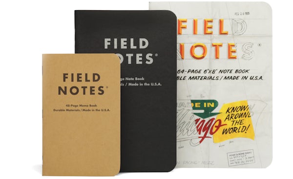
These note books are a new size for us; a handy 6" × 8." The 64 pages are graph-ruled in “Non-Repro Blue,” a particular shade that is still used in the graphic arts industry to be easily removed from photostats or scans of black-and-white artwork. As usual, the inside covers are full of historical information, illustrations, and wise-cracking.
SPECIFICATIONS:
- 01.
Cover art by Heart & Bone Signs, Chicago, Ill. (chicagosignpainters.com) in collaboration with Bob Behounek.
- 02.
Printed by the good people of The Graphic Arts Studio, LLC, Barrington, Ill.
- 03.
Cover: Westrock Tango C1S 16pt “White,” with a thick, brute force 4-color application of process-color soy-based Superior inks.
- 04.
Innards: Domtar Lynx Opaque 60#T “White,” with a fine, 1-color application of “Non-Repro Blue” soy-based Superior ink.
- 05.
Cover and innards printed on a Heidelberg Speedmaster CD 102S six-color printing press.
- 06.
Bound with a Muller Martini 6-pocket saddle stitcher with cover feeder/scorer.
- 07.
Corners precisely rounded to a 3/8" (9.5mm) radius with a Challenge DCM double round-corner machine.
- 08.
Graph grid: 3/16" × 3/16" (4.7mm × 4.7mm).
- 09.
Note Book dimensions are 6" × 8" (152.6mm × 203.2mm).
- 10.
FIELD NOTES uses only the Futura typeface family (Paul Renner, 1927), in collaboration with Monotype.
- 11.
All FIELD NOTES note books and memo books are printed and manufactured in the U.S.A.
- 12.
Limited Edition of 25,000 2-Packs.
- 13.
SKUs & UPCs: The Chicago Look 2-Pack FNC-66 850032279369, The Chicago Look Subscription FN-SUB66


